Brand page for modern brand review site
Thingtesting
UX UI Designer
9 weeks
Sade Taiwo, James Frewin, Jenny Gyllander
Whimiscal, Figma
User Flow, User Personas, Wireframes, High fidelity
Problem
01
Thingtesting was experiencing a fast-growth in their early stages of launch and needed to improve their UX in order to retain visitors and convert them. One of the priorities was to improve the retention, engagement and conversion of the brand page UX.
Impact
02
After the design went live, Thingtesting were able to
Increase their monthly company claims by 12 ( tracked over a period of 3 months). Before the redesign, they were onboarding 5 brands per month and after the redesign, they were onboarding 12 (and most were inbound requests).
Brands that has existing brand pages had increased session times (from 10 - 40 secs)
The brand partnership manager at Thingtesting also stated that she saw an increased interest and appreciation for the service after the redesign.
Research
03
Google Analytics
The reason the brand page was one of our first priorities to address in terms of redesigning was because when we looked at the Google analytics, we could see that the journey look like this:
Step 1: User searches for brand in Google (e.g. Heights supplements)
Step 2: User clicks on Thingtesting brand page (e.g Heights supplements brand page)
Step 3: User explores the rest of the site, the next most popular page was the brand directory
Learning: What we discovered is that users were not introduced to the site via the homepage (as they usually would with any other website). They were technically be entering the website through the backdoor and working their way around from there so we decided to prioritise the brand page and treat it as if it was the homepage.
Research Survey
We had theory that the brand page was going to be the point of conversion was further highlighted by a user survey we conducted. We created a 10 question survey for the Thingtesting user testing group and our findings were as follows:
Not enough information to make a buying decision: Users felt like the brand page did not offer enough information for them to make a purchasing decision, they still had to source other websites for more detailed information on the brand.
Lack of tools: Users wanted to be able to compare brands. Users were frustrated by the idea of opening up multiple tabs and switching to compare products.
As well as this, we got basic information about their economic status so we could build comprehensive user personas.
Comp Analysis
Naturally, if we follow Jakobs law on users liking digital product they use to feel familiar, we would want be looking at other review sites to explore how they execute review pages for brands.
However, when having conversations with the CEO, a frequent USP of Thingtesting was brought up. She wanted the experience to feel circular. The user would discover brands on Thingtesting, Shop the brand and then come back to Thingtesting to share their experiences.
So, although Thingtesting is a review site, it had to fit in seamlessly with the e-commerce experience so when building out the brand page we looked into other e-commerce sites so that our brand pages felt experiential as opposed to being for informational purposes only.
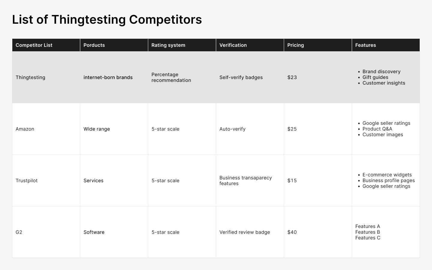
From the competitor analysis, we can see Thingtesting is filling a gap in the market by encourage consumer engagement. Therefore, we were justified in our theory to approach the inlace differently from it's competitors.
Card sorting
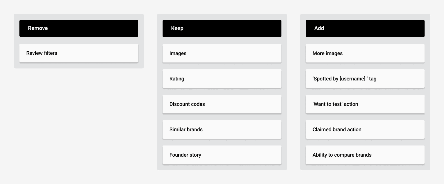
Thingtesting had community of the early adopters of their product so we utilised them by conducting a card sorting session that would allow us to see the features that they wanted to 'keep' and the feature that wanted to add. This would then determine the rest of the project. This considered the whole platform but we would then decide which elements could be considered for the brand page. Any features not of the list were either removed or deprioritised.
Design Process
04
Wireframing
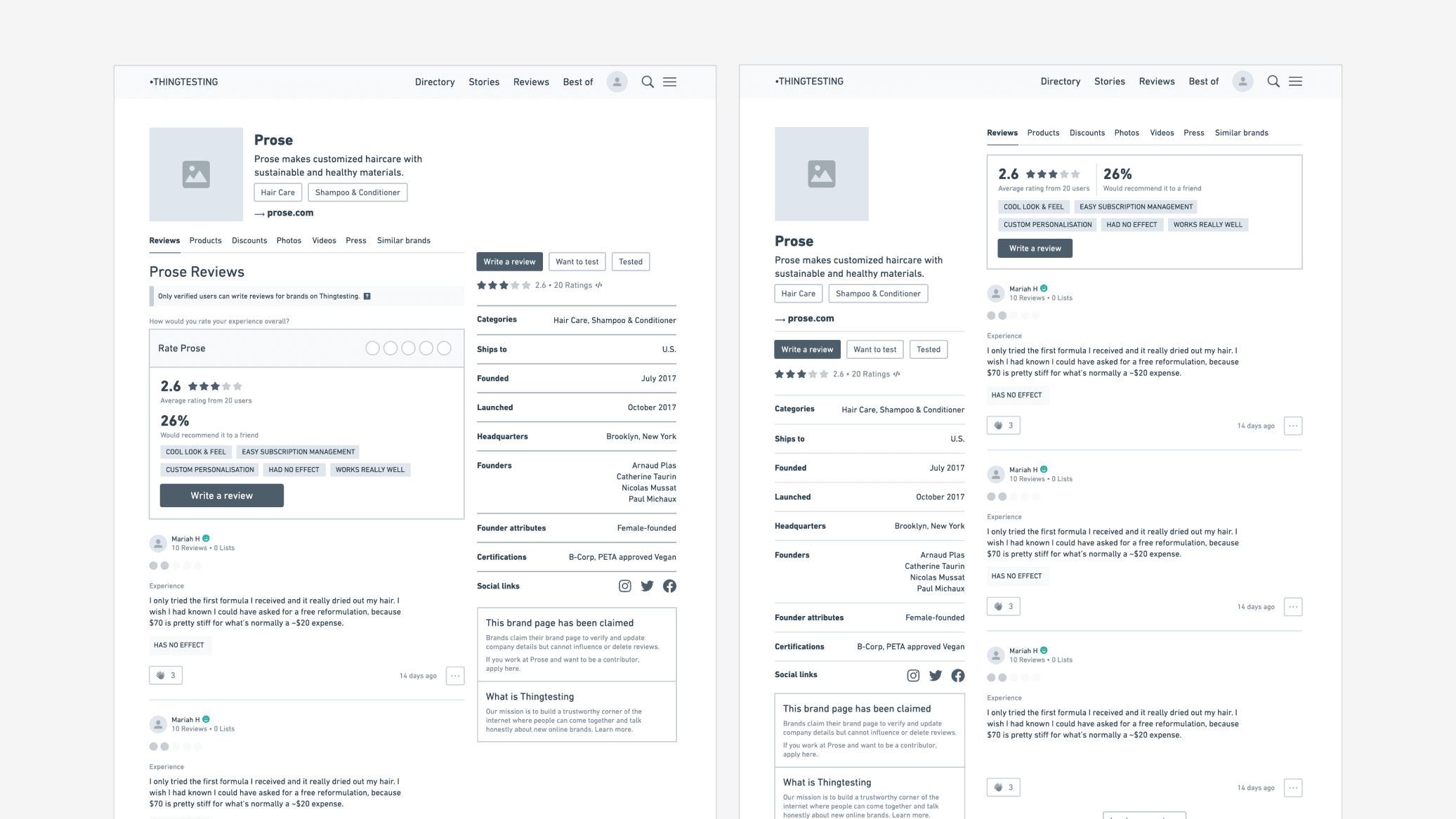
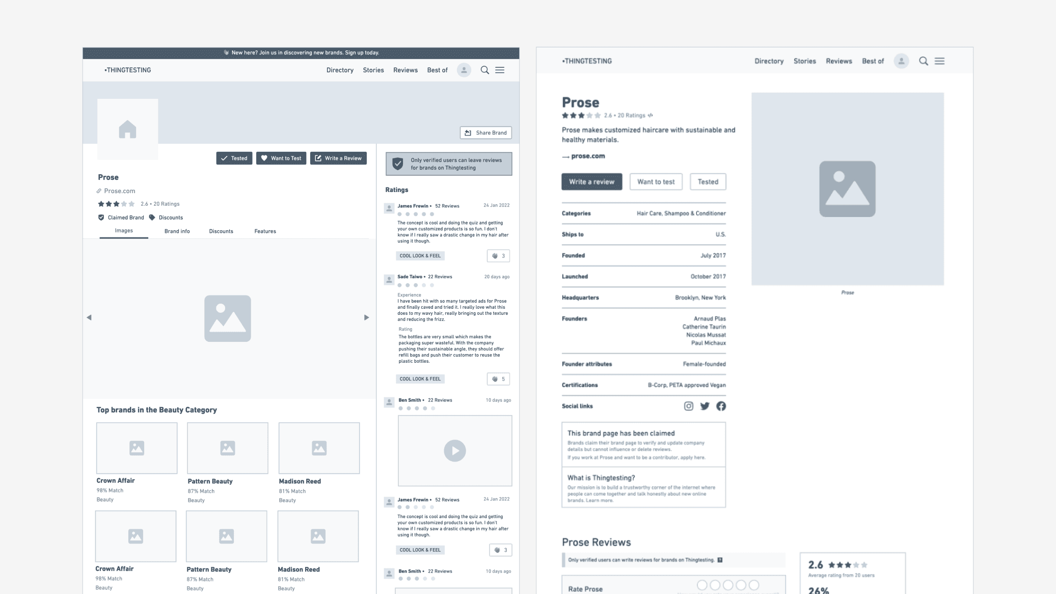
The wireframing stage consisted of iterating 3-5 versions of the brand page. The final features of the brand page included all the features suggested from the initial card sorting exercise and competitor research:
More images
'Want to test' action
'Claim brand' action
There was a feature that had been pushed back due to technical restrictions which was the 'claimed by' feature as we needed user permissions which we did not have yet.
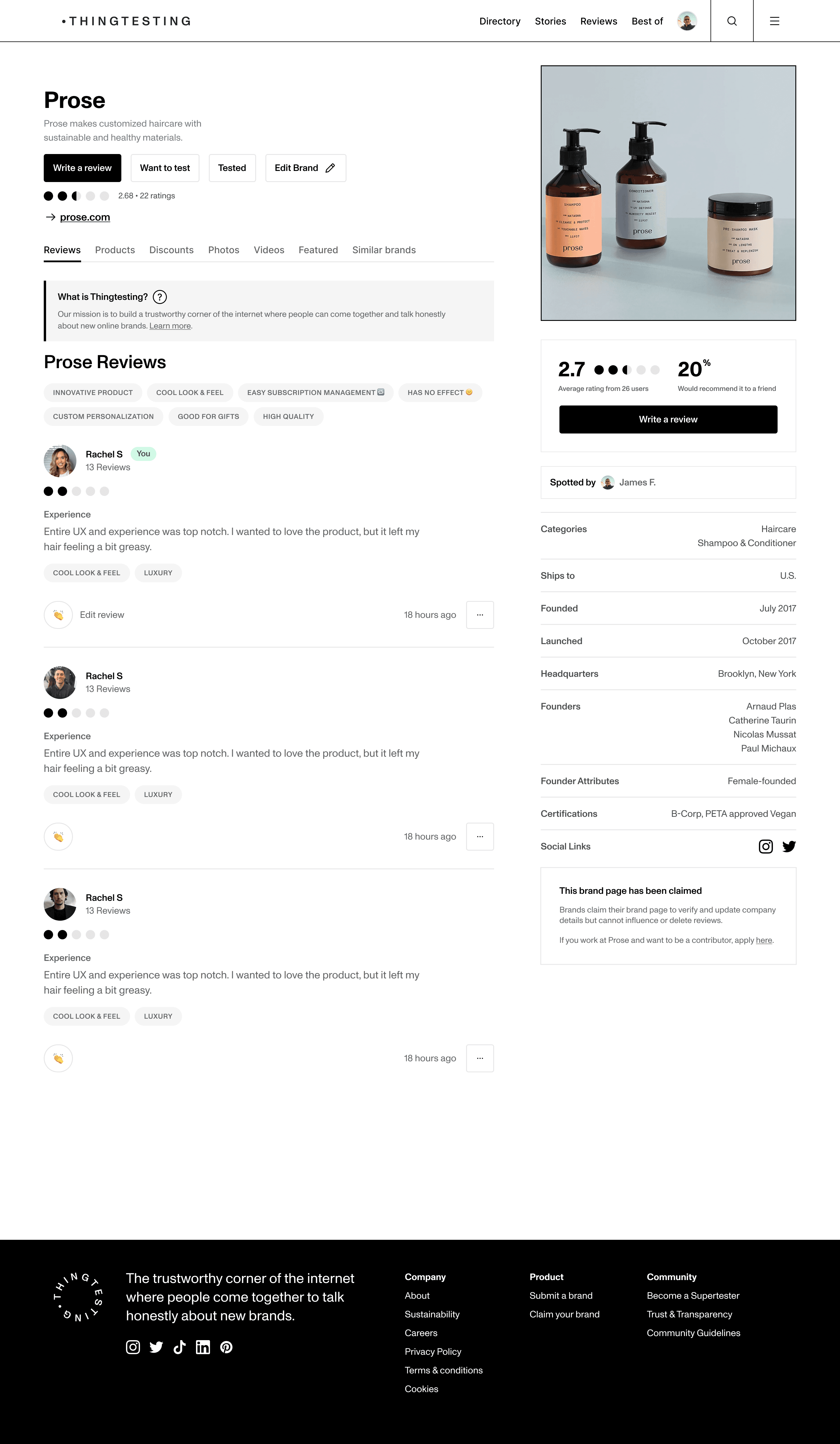
The key features we wanted in a brand page was to feature enough information above the fold that would engage users to scroll down further.
High fidelity
We then moved on to creating the components needed for the high fidelity screens. We created them for both options as we still had not landed on a layout at this point.
At this stage, we conducted a casual workshop where the founder and myself went through the wireframe options and picked out elements we liked from each design.
We liked the information being on the left. Your eye is drawn to the left naturally and we wanted to offer as much valuable information on first glance to draw the user in.
We like the flexibility of the tab menu, this gave us the opportunity to expand on the information we offered the user.
We liked the CTAs being in a prominent position, as that was how we were judging the conversation rate of the page.
An important piece of the page is also the reviews we positioned those on the left and and secondary information on the right.
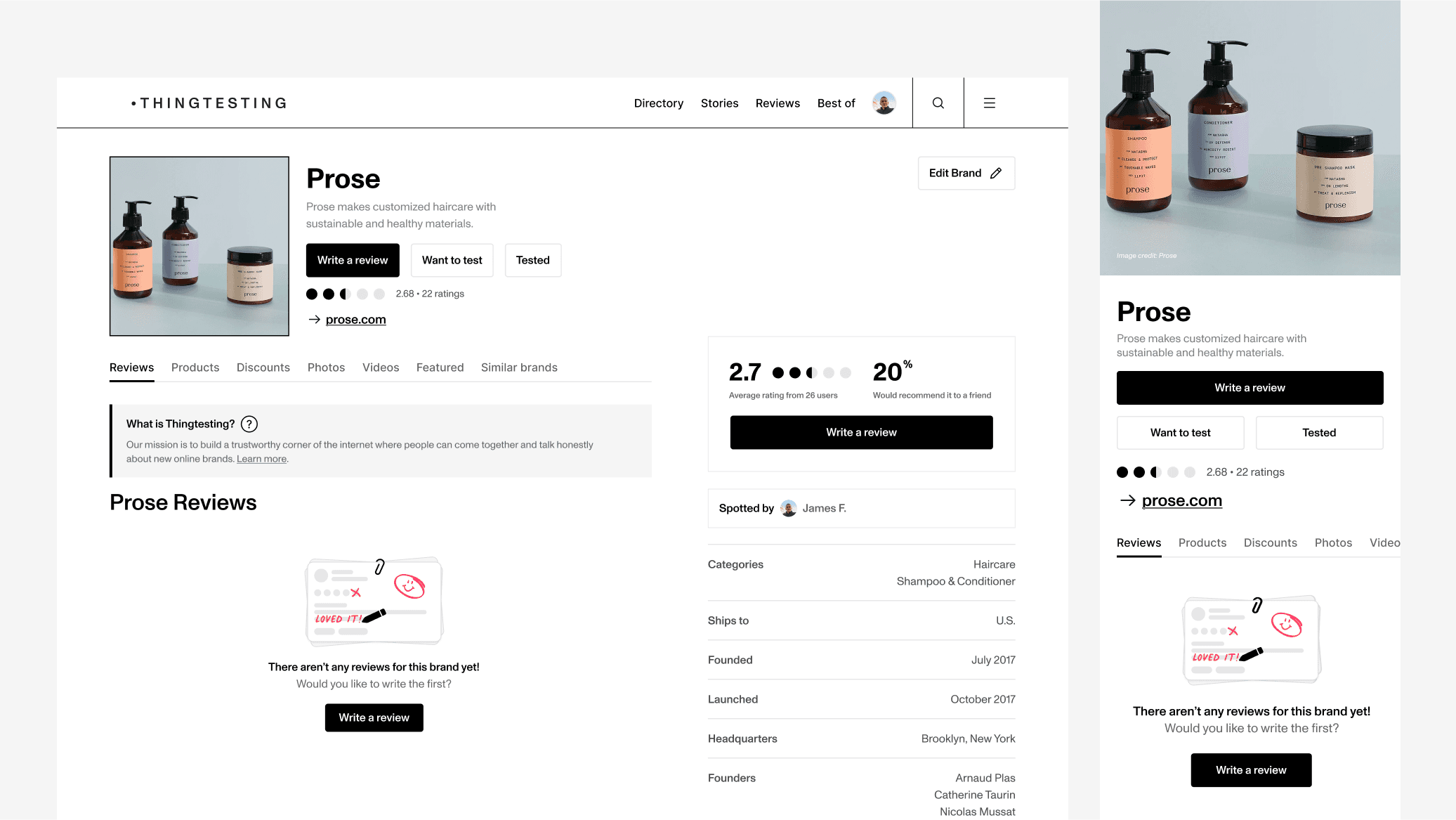
After launch, we did realise that we had missed a crucial part of the this page which is the page state for when it's launched (it's empty state).
Final
05
For the final design we landed on two options, the team liked both and thought there were benefits to each layout so we decided to A/B test the below screens. The goal for this page was to get the user to engage with the brand (by clicking on their URL) and ideally writing or engaging with the reviews.